Flex Banners

5 Tips for Designing an Eye-Catching Hoarding
Vishal Sharma
Marketing Manager • Oct 05, 2026
Hoardings (or billboards) are one of the most effective forms of outdoor advertising. But because people view them while driving or walking by, you only have about 3 to 5 seconds to capture their attention. Here is how you do it right.
Since drivers only have a few seconds to read your hoarding, keep your main text to 7 words or less. If your message is too long, people will stop reading it halfway through. Make it punchy and direct.
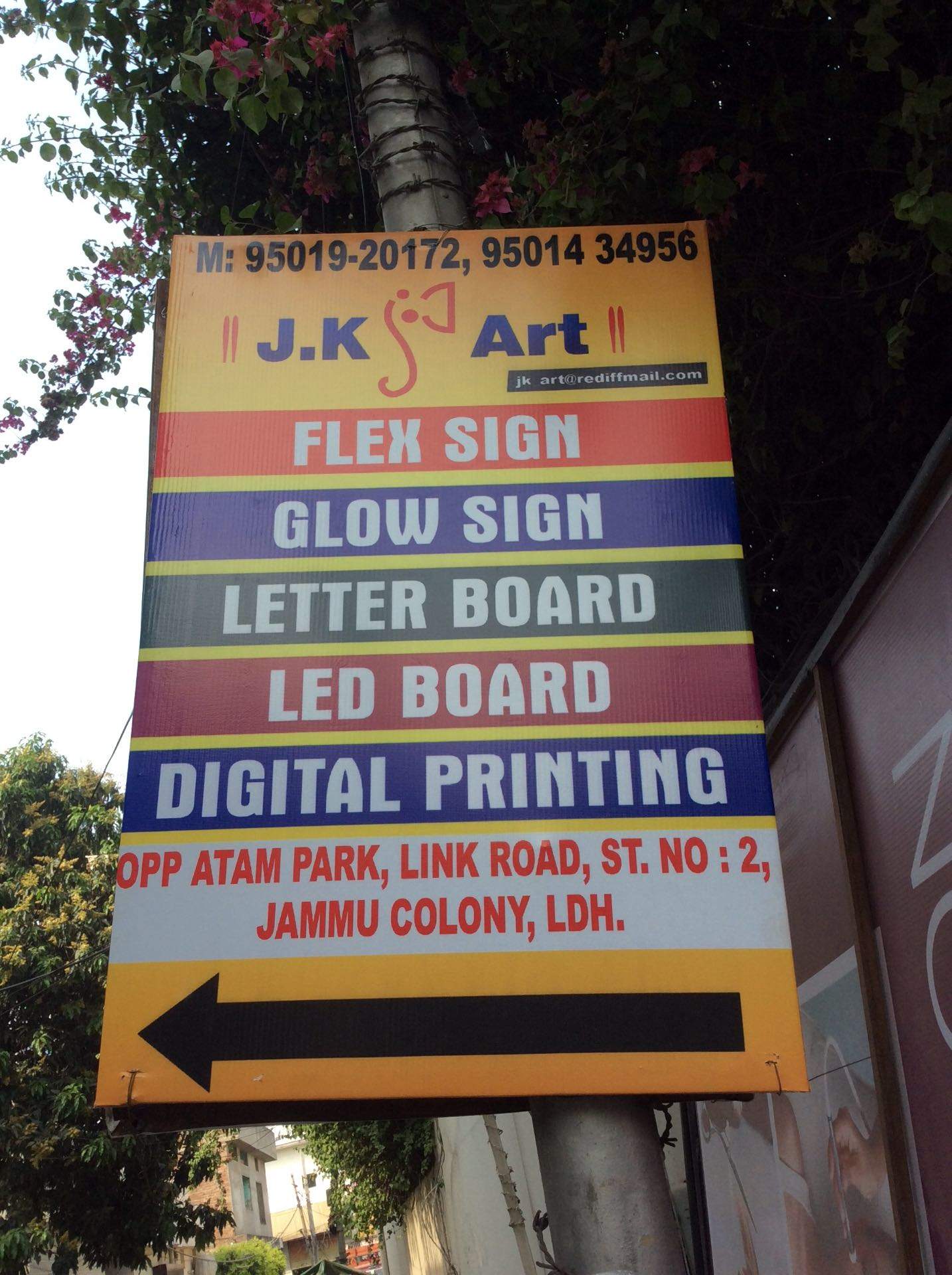
Contrast is crucial for visibility from a distance. A black text on a yellow background, or white text on a dark blue background, is much easier to read than similar shades placed together. Avoid pastel colors for text.
Never use thin, elegant script fonts on a flex board. Stick to bold, heavy sans-serif fonts (like Impact, Arial Black, or Montserrat ExtraBold). The text needs to be readable from 500 feet away.
A hoarding is not a brochure. Do not clutter it with 5 different product images. Pick one high-resolution, striking image that conveys the emotion or the core product of your campaign.
Include a short, memorable website URL or a simple phone number. Better yet, create a catchy hashtag or a directional cue (e.g., "Take the next left!"). Don't expect drivers to write down a long address or phone number.
When designing for large flex printing, ensure your images are at least 300 DPI at 1/10th scale. If you use low-resolution images from WhatsApp or Google, they will look highly pixelated and blurry when printed on a 20ft hoarding.